Python - Matplotlib
This page can be downloaded as interactive jupyter notebook
Matplotlib is the most prominent Python package for creating plots for data visualization. We will import the pyplot module as plt.
import matplotlib.pyplot as plt
Plotting graphs
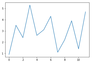
Plotting one dimensional data only needs two function calls: plot(), which takes the data as list, tuple or one dimensional Numpy array and show(), which will display the graph. In a regular Python script, the methos show() will open a new window. Within a Jupyter notebook, the figure will be displayed inline.
data = [0.9, 3.5, 2.4, 5.3, 2.6, 3.1, 4.3, 1.1, 2.2, 3.9, 1.4, 4.7]

plt.plot(data)
plt.show()
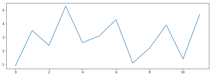
The size of inline plots can be set with the command:
width  = 12
height = 4

plt.rcParams["figure.figsize"] = [width, height]
Plotting the same data again will now produce a wider figure:
plt.plot(data)
plt.show()
Plotting 2D data
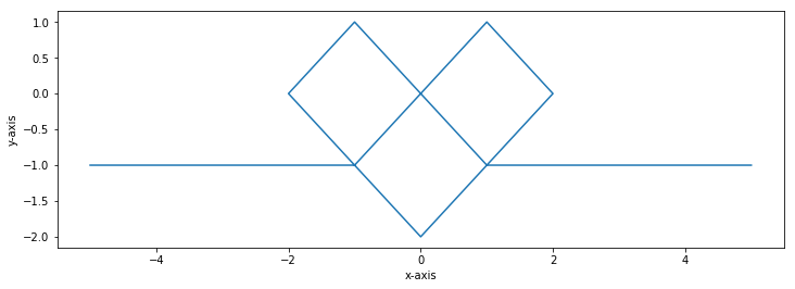
In the examples above, we plotted a one dimensional data set, representing y-values. Matplotlib assumes, that the first y-value corresponds to the x-value 0, the second y-value to 1 and so on. If we want to give explicit x-values, we can pass both to plot().
Note: The x-values are passed as first, the y-values as second argument!
x_values = [-5,-1, 1, 2, 0,-2,-1, 1, 5]
y_values = [-1,-1, 1, 0,-2, 0, 1,-1,-1]
plt.plot(x_values, y_values)
plt.xlabel('x-axis')
plt.ylabel('y-axis')
plt.show()
Matplotlib and Numpy
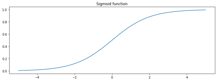
Matplotlib can not only plot lists of numbers, but is also compatible with Numpy data. In the next example we plot the sigmoid function using Numpy.
import numpy as np

x = np.linspace(-5, 5, 50)
y = 1/(1+np.exp(-x))

plt.plot(x, y)
plt.title('Sigmoid function')
plt.show()
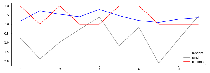
Plotting multiple graphs
By calling plot() multiple times before show(), different graphs can be plotted in one figure. To differentiate these graphs, we can add a label and color value to each dataset using the according parameters. To add a legend to the figure, we simply call legend() before show(). The following example demonstrates this.
plt.plot(np.random.random(10),         label='random',   color='blue')
plt.plot(np.random.randn(10),          label='randn',    color='gray')
plt.plot(np.random.binomial(1,0.5,10), label='binomial', color='red' )
plt.legend()
plt.show()
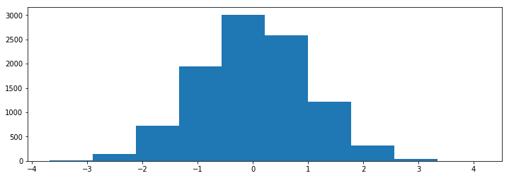
Plotting a histogram
Plotting histograms is done with the function hist() instead of plot(). The example below demonstrates the usage.
plt.hist(np.random.randn(10000))
plt.show()
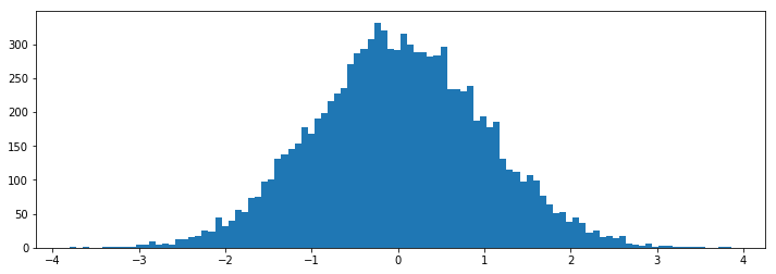
The number of bins is default set to 10. We can specify the number of bins by using the parameter bins:
plt.hist(np.random.randn(10000), bins=100)
plt.show()
Plotting images
Matplotlib can also be used to plot images using imshow(). In the following example we create and plot a RGB example image:
I = np.zeros((100,100,3), dtype=np.ubyte)
for x in range(100):
    for y in range(100):
        if 2*x+y < 100:
            I[x, y, 0] = 255
        elif 2*x+y < 200:
            I[x, y, 1] = 122
        else:
            I[x, y, 2] = 255

plt.imshow(I)
plt.axis('off')
plt.show()

In the example above we passed an array of type ubyte to imshow(). In that case, the function assumes, that 255 is the maximum intensity according to the maximum value of ubyte. We can also pass an array of type float to the function. The maximum intensity is then assumed to be 1.0:
I = np.zeros((100,100,3), dtype=np.float)
for x in range(100):
    for y in range(100):
        I[x,:,0] = x/100
        I[:,y,1] = y/100
        I[x,y,2] = (x+y)/200

plt.imshow(I)
plt.axis('off')
plt.show()

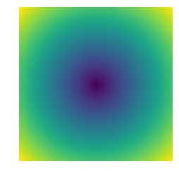
Plotting a 2D array works in a similar way, but by default a heat map is displayed and the array is scaled according the minimum and maximum value:
I = np.zeros((100,100), dtype=np.float)
for x in range(100):
    for y in range(100):
        I[x,y] = np.sqrt((x-50)**2+(y-50)**2)

plt.imshow(I)
plt.axis('off')
plt.show()
To display a correct gray-scale image, we have to specify the color map and the value range:
I = np.zeros((100,100), dtype=np.ubyte)
for x in range(100):
    for y in range(100):
        I[x,y] = x+y

plt.imshow(I, cmap='gray', vmin=0, vmax=255)
plt.axis('off')
plt.show()

The tutorial demonstrated only a very small part of Matplotlibs capacities! Matplotlib can e.g. be used to plot 3D-data, images or animations. For further informations you may start with a pyplot tutorial.
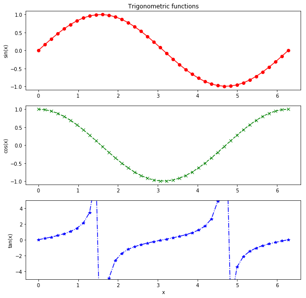
Subplots
Subplots can be used to show multiple plots in one figure. The following example demonstrates the usage as well as some additional modifications like explicit axis limits, labels and graph styles.
plt.rcParams["figure.figsize"] = [10, 10]

x_values = np.linspace(0, 2*np.pi, 40)

plt.subplot(3, 1, 1)
plt.plot(x_values, np.sin(x_values), 'ro-')
plt.title('Trigonometric functions')
plt.ylabel('sin(x)')

plt.subplot(3, 1, 2)
plt.plot(x_values, np.cos(x_values), 'gx--')
plt.ylabel('cos(x)')

plt.subplot(3, 1, 3)
plt.plot(x_values, np.tan(x_values), 'b*-.')
plt.xlabel('x')
plt.ylabel('tan(x)')
plt.ylim(-5, 5)

plt.show()
| Author: | Dennis Wittich |
| Last modified: | 02.05.2019 |